I've never been to great at writing, nor at illustrations, yet, I feel that a combination of the two can result in something phenomenal. First, however, I must explain the subjectivity of the image in relation to text.
An image consists of lines in different forms, unique colors and pigments, and shapes. Every artist has his or her own theory on a circle, a swirling line or the color cobalt blue. However, it is exactly that which makes the image so subjective. Colors can be redefined through a simple painting. Sure, there are some connotations with colors such as during Picasso's "Blue Period" when his works had a blue tint to them, when it is assumed that he was in a depressed and saddened state. This can be verified as his close friend had passed away just before this artistic shift, however, blue now holds this as a connotation. However, this assumption of blue=sadness can easily be overcome by a work which uses the same blue but in a much different manner. Franz Marc's work Blue Horse is not a symbol of sadness. It overcame that connotation for the color and created an entirely new feeling and sensation for the hue. It is because of this that I find imagery to be more subjective than text. Colors, line, form, they can all be redefined through a single work and from that, the works can be perceived in many more ways than a text filled with predefined words.
Simply put, based on how I view both text and image, I feel that a mixture of the two is prime. Text is the art form that would guarantee the message of the writer to be understood because of the verbiage. however, the always redefined aspects of an image would add a bit more of the artist's creativity to the work. I like to create within the realm of text and image with a main focus on color. Text accentuates what I express as through the color and images, yet the color also emphasizes, if done correctly, the meanings of the words within the text. The linking between these things is how I feel my art will become perfect. However, art in it's true form without text is what I would consider genius. If an artist can communicate his or her thoughts, emotions or message through color and form alone, there is no space for subjectivity. The artist has mastered ultimate communication through image.
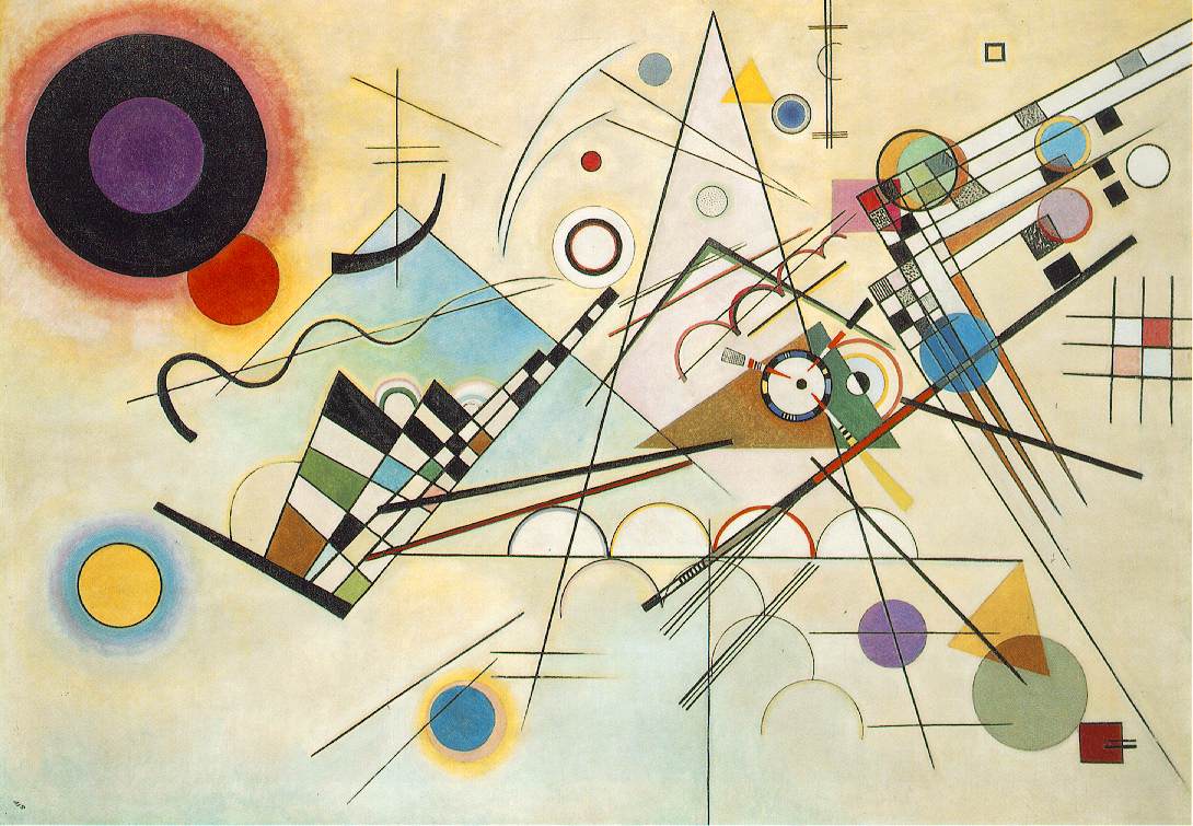
I am not perfect let alone an artistic genius, but for some one to define colors and forms so freshly like Wassily Kandinsky, I would certainly consider them a god.
As a side note, perhaps I should try reading A Clockwork Orange again and reevaluate my thoughts on text always having specific definitions and being objective. For now, I will stick with what I have said above.
No comments:
Post a Comment